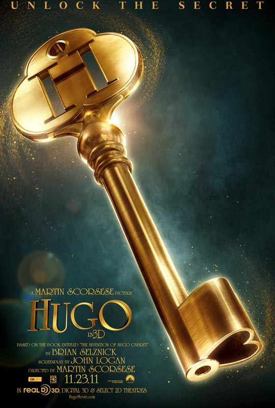
Below, I’ve described how much I like the poster for One for the Money, and how much it makes me want to see the film. The opposite is true for the advance poster for Hugo. I’m not sure I can adequately describe how much I dislike this poster, but I’m going to try.

It’s a key. That’s all. Yes, a key is important to the story, and yes, the tagline “Unlock the Secret” refers to key imagery, but this is still, in my humble opinion, woefully inadequate to describe or present this movie. What modern movie doesn’t have a secret? “Unlock the Secret” is so generic and universal that it is virtually meaningless in this or any context. Okay, there’s a secret. So what.
Scorsese’s movie is about the glorious infancy of the film industry, something that is impossible to discern from either the poster or the preview that I saw. Why should that be such a secret? It’s about an orphaned child who has more smarts than the adults who surround him, and who has learned to take care of himself in a decidedly hostile environment. Why should that be such a secret? It’s got a cool (and sorta scary) automaton that links the kid with one of the fathers of the film industry, and in such a way that provokes wonder and awe. Why should that be such a secret?
Why should there be any secret to unlock?
I’ve often railed against previews that reveal too much about their movies; the one for Paranormal Activity ruined the film’s climax because it included the shot of the hurtling body that I knew was eventually coming when I saw the movie. Yet this poster is the exact opposite. It reveals nothing about the project except for a heart-shaped key, a symbol that felt to me like sentimental balderdash.
It’s a terrible poster.
Perhaps on a different movie, a less ambitious movie, it wouldn’t bother me so much to see something so poorly represented. But even though I’m not Martin Scorsese’s biggest fan, I still think he deserves better than this. Truthfully, this poster so turned me off that I was not interested at all in seeing the film itself. Bet that’s not what the publicity people want to hear, but it’s true. The factors that changed my mind were the fact that it is Scorsese, and therefore has relevance; it got pretty good notices (which I didn’t read but of which I was aware) and that it was chosen as the Best Film of the Year by the National Board of Review. That got my attention.
So I saw it, and I liked it. But I still hate this insipid poster. 15 Dec. 2011.

You are correct. It’s almost as if they had no idea who they wanted to market a family friendly Scorsese film to. I do disagree with your Katherine Heigl poster. Liking the female lead on a poster (attractive qualities) doesn’t cover how horrible this movie is or her previous movies.
I’m amazed that Hugo has done as well as it has, considering the terrible marketing it has received. The second poster, with Hugo hanging from the tower clock, is better, in that it indicates action and suspense, but it still provides absolutely no clue to what the movie is about. Sometimes that can work, but I think with a subject as cool as the origins of modern moviemaking the marketing folks could have devised an approach worthy of its subject. But the advance “key” image is still a terrible poster. And not that it matters at all, but a key is an important part of Extremely Loud & Incredibly Close, too.
As for the One for the Money poster, I do like it because Katherine Heigl is so hot, but the poster really captures the essence of the story: an unlikely woman going after “not-so-good guys” with a sense of humor. It is a beautifully designed poster that shows off Heigl at her best, yet supports the film without being exploitive. The poster was better than the movie.
I think you are getting a little too analytical in the fact that the poster really just shows off Heigl. It’s not much different than the lazy This Means War poster that shows off Reese Witherspoon. At least the key in Hugo (still a bad poster) served a purpose to the plot.
In Extremely Loud, the key is a rip-off you could have bought in a rummage sale or accidentally picked out of the trash. I also don’t want the argument that it is a MacGuffin; it’s another pointless plot point in a bad movie (and poorly reviewed book if you go back to the source material).
The whole point of this particular post was to show how this beautiful poster has enticed me not only to see the movie, but to read the book. Janet Evanovich’s books about Stephanie Plum have been around for more than a decade, but I’m only now getting to them, and it’s because of this poster — and the film that it advertises. The poster does more than show off its star — it sets the tone for what should have been a superior film. I don’t think that’s being too analytical.
As for the key situation, the key in Extremely Loud is just as important to its plot as Hugo‘s is. In both movies the keys are pretty much red herrings for the audience, although they are important to the characters. Remember, Hugo finds his key on the railroad tracks!